Target

BUSINESS OBJECTIVE:
Improve cart and checkout experience to allow a higher purchase conversion ratio and surface streamlined experiences for authenticated users.

Improve cart and checkout experience to allow a higher purchase conversion ratio and surface streamlined experiences for authenticated users.
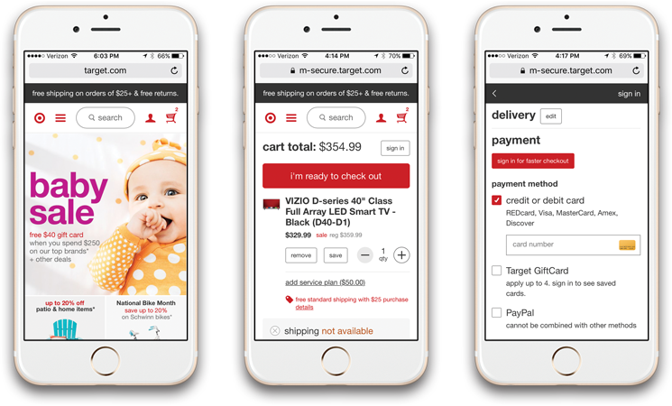
The research identified that Target’s mobile web cart was crowded with product messaging that was not relevant for the user at the time of product attached. Studies indicated that verbose messaging hindered the purchasing decision. Also, cart and checkout lacked content to encourage conversion of loyal REDcardTM members.